Member Spotlight: Heather Krause
Megan Murphy, ASA Communications Manager
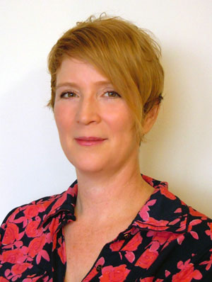
Krause
Heather Krause is curious about everything. This explains why she went through a variety of career aspirations while growing up in Harrisburg, Pennsylvania. She thought about being a rock and roll singer, vet, lawyer, juggler, and even a writer until she took a course her freshman year at Penn State University called Social Problems. “This was the first time I really understood that there were people who were professional researchers,” she said. “I become very interested in that as a possible career.”
In her pursuit to understand how society worked, she also wanted to understand how computers worked, so she learned to program and write code. The combined interests led to a major in quantitative sociology. She did not use her undergraduate degree in an obvious manner though. Instead, she worked for more than a decade establishing and running an art therapy consulting practice. “I have always had a very strong interest in making the invisible become visible, and I have always loved to draw and paint—since childhood—but I do not have any formal art training at all. I have a real love of patterns though—especially the hidden kind.”
It was while working as an art therapist that she decided to return to school and earn a degree in statistics. “I was inspired to do this by a deep level of frustration with the research that was being published in my field and in fields that were directly impacting my life, such as political research, health care research, and poverty research,” she said. “In my opinion, too much of the research at that time was invested in maintaining the status quo and not really exploring creative explanations for the empirical reality that was present.” She knew that if she wanted to have a say about empirical evidence and to have a conversation with scientists in their own language, she would need better credentials.
Art therapy and statistics turned out to be similar. “I had a hunch before going into the statistics department that the practice of statistics is equal parts art and science—both subjective and objective—which is what makes it so valuable.” Both jobs involve looking through many symbols for hidden patterns and meanings and making them visible, usable, and purposeful.
Pick a topic you are interested in and follow it from beginning to end. Scrape data on the topic from the web; analyze it using three methodologies in two statistical software packages.
Take the time to play with as many tools as you can get your hands on. Learn to program at least a bit in several languages.
Download free trials of all the visualization software and experiment.
Show your work to as many nonstatisticians and nonscientists as are willing to look at it.
Learn what people like to look at and how people see by making visuals and showing them to people.
Do crazy things.
To make the statistical analysis purposeful, though, Krause needed a way to make it useful to the people in charge of implementing various social programs. “I wanted high-quality statistical analysis to be accompanied by equally high-quality communication of those results,” she said. That is why she started Datassist.
Datassist is a company that specializes in helping nonprofits and NGOs find the data they need and evaluate it in a way that will serve their mission. To communicate the data in a way that is accessible to a diverse audience, Datassist researchers present data using infographics. “A well-designed infographic can provide a clear narrative of the results that have emerged from an analysis while putting the data into its real-world context and simultaneously showing that there is still uncertainty present,” Krause said. “Effective communication of statistical results is very important to statistics and an area that could use more focus within our profession.”
When asked why infographics were important to statistics, Krause said, “An important aspect of a traditional statistical graphic is to leave a lot of room for interpretation—to provide both the data and the results to the reader in as scientific a way as possible. However, they often ignore basic design principles and disregard the human brain’s need for narrative.” She also noted that some infographics, in an attempt to be artistic, lose the scientific. “Much of what is being called an infographic today is an oversimplification of complex analysis and a biased and often deterministic presentation of probability.”
Being curious about everything has inspired Krause to address questions many people think are not possible to ask, much less answer, so it is not surprising that her number-one piece of advice to young statisticians is to be curious. “This is especially true if you want to go into the data visualization field and data science. The more curious you are, the more substantial and effective your pieces will be.”


 (No Ratings Yet)