

In 2010, we interviewed Nathan Yau and asked him about his then fairly new data visualization website FlowingData. Since then, he has become an expert in data visualization, earned his PhD, written a couple books, and expanded his website to include membership, newsletters, and tutorials. We recently caught up with him to see what he has learned since 2010 and what he can teach statisticians and data scientists about data visualization and information design.
What has been the most interesting or challenging part of maintaining FlowingData?
When we talked last, FlowingData was a side project I worked on for fun. Since graduating, FlowingData has become my full-time job, so the site has evolved in its 17 years. The site is 100% member-supported now, I publish a lot more of my own data projects, and I wrote books based on my work.
Recently, you published the second edition of your book, Visualize This. You wrote on Twitter/X, “The second edition, out in June, is still that step-by-step guide. Concrete practical examples. A variety of tools. A data-centric approach. But every bit has been updated. It turns out a lot can change.” Can you give us some specific examples of what has changed from your first edition?
When I wrote the first edition of Visualize This, people approached visualization from a narrower point of view. The focus was on analysis, which meant charts were always optimized for perceptual efficiency. With a more flexible approach aimed at data communication, visualization has branched out to games, art, entertainment, and social media, which can mix with statistics, data science, and information design.
The tools are also different. For example, we used primarily Flash to animate data and make it interactive on the web a decade ago, but Flash was deprecated, and now there’s a wide array of JavaScript libraries and web frameworks that work better on various devices. Visualize This covers the mix of tools so you can decide what works best for you.
Can you share an example of a successful data visualization project you have worked on? In your opinion, what do you think contributed to its success?
The goal with most of my projects is to help people relate to a data set, which encourages further exploration and a better understanding of the data overall.
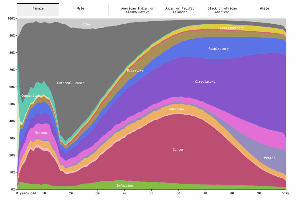
For example, I made a series on mortality that lets you enter demographic information, and the charts show or simulate data based on what you enter. The project worked well because people could see themselves more easily than if I were to just show life expectancy curves. The animations also help show how the data plays out and how a distribution builds.
Why is knowing how to visualize data so important?
It can be a challenge to explain data to a general audience, but people are often better equipped and more willing to read charts. So when you want to communicate data and findings to people who don’t work with data regularly, visualization is the best way to do it. When designed correctly, you can potentially expand your reach.
With all the data visualization tools and platforms out there, how do you know which tools to use? Are there any you recommend for beginners?
I recommend people work with what they know until it doesn’t do what they want anymore. That could be Excel. That could be R. That could be JavaScript. Figure out what you want to make, and then find the tools that help you do it.
My own toolset centers around R for analysis and static graphics, JavaScript for interaction and animation, and Adobe Illustrator for editing.
How do you stay up to date on emerging trends and best practices in data visualization?
My favorite part of FlowingData work is analyzing and visualizing data sets myself, which forces me to learn new tools and approaches for visualizing data. Also, like last time, I subscribe to feeds, sites, and newsletters.
What are rules a statistician should follow to make their charts better? What are common mistakes to avoid?
I talk about chart rules sometimes, and it’s usually in the context of treating rules more like suggestions. My main suggestion for statisticians who want to make great charts is to treat visualization as a way to explain what your data is about. Don’t assume that if you make a chart the data instantly shows something interesting. Annotate and highlight. Choose visualization methods that help readers relate.
How do you see data visualization changing in the next five years?
The process of making charts will likely grow easier—maybe with AI-based tools and maybe with more traditional point-and-click tools. Hopefully with less time spent on implementation, there will be more time for analysis, clarity, and fun with data.
Is there a new skill you are currently learning?
I’ve grown more curious recently about how we can use the playfulness of games to encourage data exploration and understanding. So I’m leaning harder into animation and interaction.
What do you do when you are not charting data?
I cook a lot. I get a lot of satisfaction out of grabbing raw ingredients from the refrigerator and turning them into a tasty meal for the family.
Leave a Reply