
Kim Gilliam, ASA Marketing Project Manager
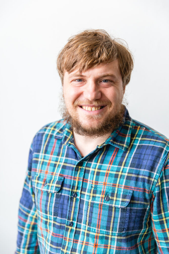
Gregory J. Matthews, statistics professor and director of the Loyola University Chicago Center for Data Science and Consulting, knows he is an unlikely creative. Over the last 15 years, his path has led him to the intersection of mathematical precision and artistic expression, where he is thriving.
Matthews admits he was a self-described art skeptic when he met his wife, who holds a BFA, almost 20 years ago. She has helped shape his perspective over time and encouraged his interest in experimenting with data art, which began shortly before their move to the Windy City in 2014. Calling Chicago home gave the couple more access to world-class art museums, galleries, art fairs, and street art, all of which continue to spur Matthews’ growth as an artist himself.
“Today, I view art very broadly,” says Matthews. “Simply, art is created with intention, and that intention is to invoke a reaction from the viewer.
“For example, consider a stop sign on the street—it’s purely functional. But place that same sign in a museum and label it as art, and its context changes. It becomes art through intention. You don’t have to like it or consider it good art, but someone deliberately put it there. The key is to try to understand their reasoning. You can then decide if it’s garbage or not, but the act of consideration is what matters.”
Data Art and Data Visualization—What’s the Difference?
Data visualization and data art are both graphical presentations of data, but they have different objectives, or rather different intentions. Matthews values and enjoys both, distilling his philosophical distinction between the two disciplines by explaining, “Data art provokes a question. Data viz answers a question.” He adds, “It sounds super corny, but this sums it up perfectly. Put it on my gravestone!”
His curiosity guides both his academic pursuits and his interest in art; it was only natural his love for statistics and the need to visualize data would converge with his desire to ask questions rather than always providing answers. Matthews has often drawn on personal information for his data art, creating abstract images from personal Google locations and Fitbit health data, turning his daily movements into colorful geometric patterns.
Beyond being visually engaging, those particular pieces are also meant to highlight a point about data privacy and the role of technology in our lives. Matthews says, “While we may monitor our personal information, have we considered the extent to which major tech companies like Google and Fitbit are amassing vast quantities of our sensitive data? What are our thoughts on this practice? Is it something we should accept?”
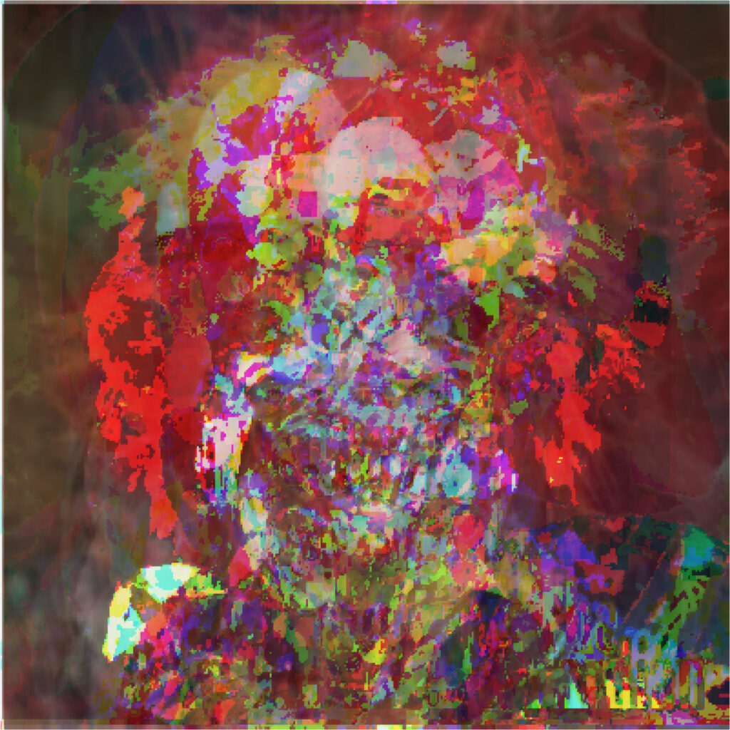
In recent years, Matthews’ work has expanded to include Google Images search data sets, and he creates art using the resulting images as input for statistical models. For example, when Matthews set out to create a new piece of data art in 2019, he searched the word “clown” on Google Images and selected the top results to create a data set to train a statistical model.
“So, imagine I’m building a model where the target is the color of a pixel, and all my predictors are every other color pixel in the image,” says Matthews. “One could easily build a model that will accurately predict the pixel color very well. But I find it more interesting to use ‘bad’ statistical models (ones that underfit the data)—rather than simply averaging these images—to produce more visually intriguing results, with greater contrast and appeal than simple pixel averaging.”
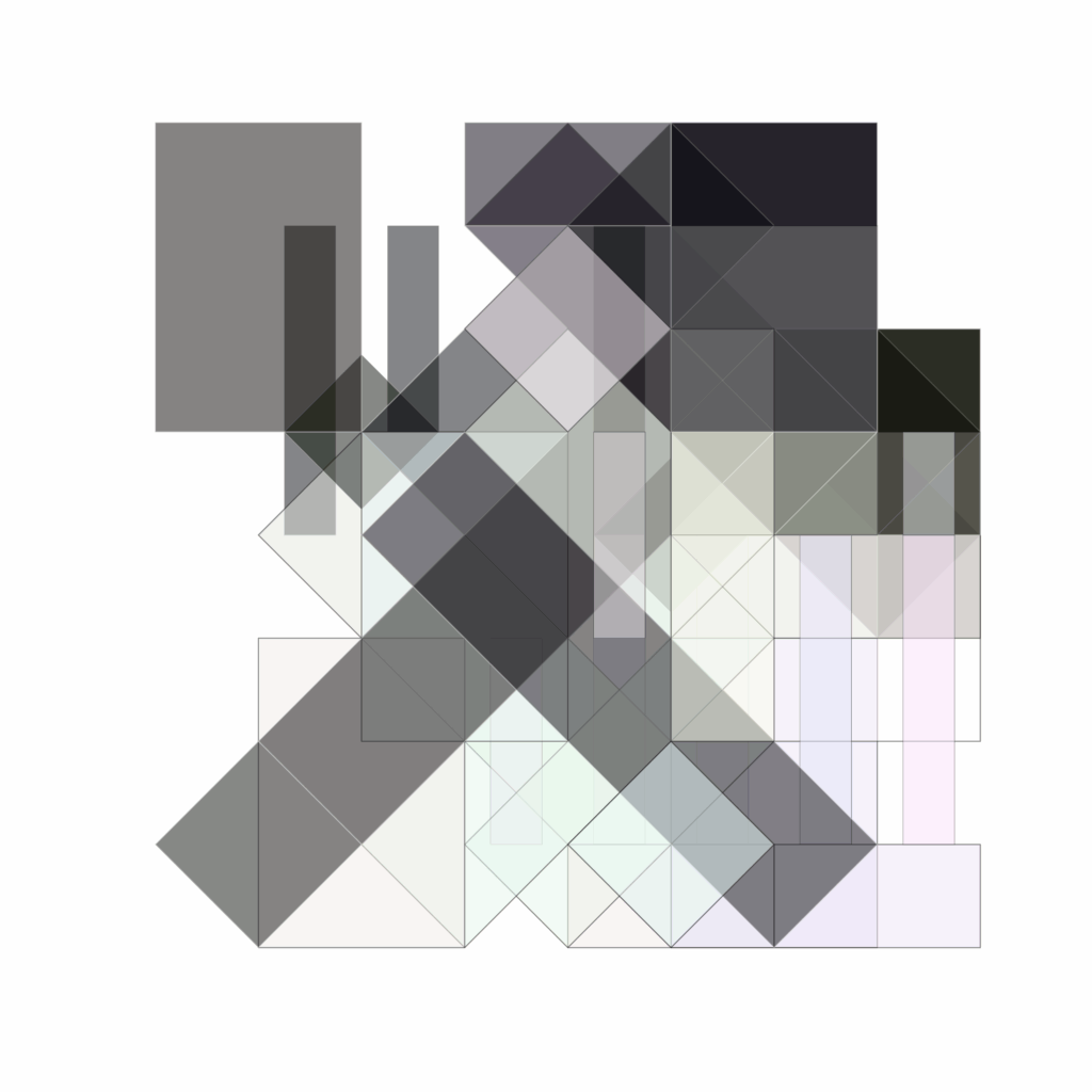
Matthews has also tackled broader social issues through his art using US Census data to create a series of black-and-white visualizations of race and income data based on ZIP codes to reveal socioeconomic patterns.
Showcasing Data Art
Matthews is the mastermind behind the JSM Data Art Show, which debuted at JSM 2016 in Chicago. His mission is to showcase data-inspired artwork within the statistical community. Although it began as a no-frills affair in an expo center, he wants to create a more gallery-like atmosphere with proper displays and an opening reception. Ambiance aside, enthusiasm was high for the art show for several years—until COVID-19 forced JSM online.
As we return to gathering together once again, Matthews remains committed to the show and encouraging more statisticians to create and submit data art. He emphasizes that the barrier to entry for creating data art is lower than many might think, urging people to start creating without worrying about expertise or even initial outcomes. “You want to be an artist? Just say you’re an artist and start making art—and sign up for the JSM Data Art Show!”
To revive the show, Matthews proposes a multi-faceted approach:
- Begin promotion efforts earlier, starting in October.
- Broaden participation by emphasizing the inclusive nature of the event.
- Recruit volunteers for organizational and promotional tasks.
- Maintain a consistent effort to build year-over-year momentum.
With his eye on JSM 2025 in Nashville, he may get his dedicated JSM gallery yet.
Uncontrolled Variables
Among his diverse portfolio of artistic outlets, Matthews produces and performs in a monthly show—a unique mix of science and comedy called “Uncontrolled Variables”—at the Lincoln Lodge in Chicago.
“So, when someone moves to Chicago, they’re expected to take an improv class. It’s a rule in this city—so I took a year of improv classes at Second City and met a bunch of people,” says Matthews. “When COVID hit, I started doing online open mics and then in-person mics when restrictions were lifted. I basically stumbled upon the folks producing ‘Uncontrolled Variables’ and wanted to know how I could help with the show. They said, ‘We need scientists,’ and I was in.”
“‘Uncontrolled Variables’ has a formula that works. The show is incredible, and hilarity ensues,” says Matthews. The format pairs scientists with comedians: Comedians perform short stand-up sets and then attempt to present scientific slides they’ve never seen before. Next, the scientist who prepared the slides is invited to re-present the slides, explaining their actual research. Matthews contributes by delivering comedic “guest lectures” featuring statistical analyses related to the show’s scientific theme.
“I can’t believe I run a monthly science and comedy show in a major American city at an actual comedy theater,” says Matthews. “And it’s not just my mom or some friends in the audience—it’s often 70 to 100 who show up through word of mouth. It’s an incredible thing.”
Statsinthewild.com
During graduate school, long before any thoughts about making art or getting on stage, Matthews started blogging about statistics and its applications in the real world. Today, he maintains the website—called Stats in the Wild —which houses his blog, his art, a library of his comedy YouTube videos, and publications.
For those interested in any type of niche topic, he recommends starting a blog or website, which he says can be an excellent way to showcase your work and connect with like-minded individuals.
“Blogging hones your writing, too, which is a really important skill that isn’t taught at all in statistics. As a STEM PhD student, you are immersed in math and science, but I believe it’s often assumed you can write. That’s not the case, and writing is hard.”
Beyond His Artistic Endeavors
Matthews is deeply involved in academic and community work. As the director of the Loyola Center for Data Science and Consulting, he focuses on applying data science to assist those with analytics needs both internally and externally, bridging the gap between statistical expertise and community needs. “I’ve wanted to lead a consulting center from day one,” admits Matthews, “but it took quite a while to make it a reality.
I’m fully aware that I’m living my dream life.
“Nonprofits with limited resources are where we can make a difference by helping them with their research or data science needs. We’ve worked with farmers markets who have some data, but they’re making pie charts in Excel—they need our help,” says Matthews. “We’ve assisted the Cook County Community Survey, which is run by several professors at Loyola University Chicago, by developing a dashboard to disseminate their survey results to the public. Getting that off the ground was a big win for us this year.”
The center is also collaborating with Beat the Streets, a nonprofit organization that uses wrestling as a tool to engage kids in underserved communities and support them athletically and academically. “We’re able to help them with their data analytics needs like data cleaning, data analysis, and data visualization for reporting purposes,” says Matthews.
“Our center-affiliated students get to work on these projects and develop real-world experience while still in school—which is great for everyone involved! We’re slowly trying to build up the center and increase its presence in the Chicago area. We’ve applied for grants and are raising money to pay students and faculty for their work so we can expand capacity, and it’s been awesome.”
Dream-Come-True Scenarios
Matthews is a husband, father, professor, statistician, artist, Kaggle champion, Big Data Bowl finalist, “openWAR” author, comedian, and improviser. If it sounds like this collection of unlikely intersections makes for a full life, it’s safe to say Matthews would agree, but he wouldn’t want it any other way. He says, “I’m fully aware that I’m living my dream life.”
It would be totally cool and super awesome if you made a data art class. Take it to the next level. GO BLERS.