Tips on Writing Results for a Scientific Paper
Kevin Cummins, Senior Statistician, University of California, San Diego
Kevin Cummins is a senior statistician at the Department of Psychiatry, School of Medicine, University of California, San Diego. Part of his job is to advise undergraduate and graduate students on how to analyze and report their findings. Over the years, he has put together a long list of helpful hints that he references when reviewing students’ drafts.

Illustration by Bret Alexander
At some point, most statistics students must learn how to communicate scientific findings. It is hoped that they are already comfortable with the formulaic structure of a scientific article: introduction, methods, results, and conclusion. The scientific community dictates this gross structure because it allows readers to immediately begin understanding the content, without first having to understand the paper’s organization. Little flexibility is allowed in the organization; however, there are fewer conventions below the structural outline, and students should recognize they have some latitude and adopt a style that improves the quality of their manuscripts.
When collaborating on a manuscript (in an applied field), statisticians’ contributions are most direct in the methods and results sections, and they are most likely to draft the results. I hope the following comments will ease the transition of newly minted applied statisticians from their academic training into their professional activities.
The results section is the core of a scientific paper. It should present new data that will be used to render a judgment about the issues raised in the introduction. The textual component of the results summarizes the general patterns and describes important statistical details, telling the reader what was found in the particular study. Implications of the findings are not presented in the results—those are saved for the conclusion.
Lean Heavily on Statistical Graphics
The use of statistical graphics often provides the strongest means for conveying the patterns in data. You should not be reluctant to lean heavily on statistical graphics. Indeed, this may be the only way to present more than a few parameter estimates without bogging down the reader. Tables are also preferable in some instances. As Edward Tufte suggests in his 1983 book, The Visual Display of Quantitative Information, complex and large sets of summary statistics can be recorded in well-organized tables. Tables can allow the reader to explore the data when there are many relevant combinations of comparisons among variables.
Integrate Nontextual Results and the Text
You should be able to read the text in the results section and know the answer to each question raised in the introduction without looking at tables or figures. This recommendation suggests you narrate the story in the graphs by parenthetically referencing your graphs when describing patterns in the data graphics. Consider the following examples:
Example 1
Watermelon production was 23% [95% CI: 20–26%] higher in plots inoculated with mycorrhizal fungi as compared to controls (Figure 2).
Example 1 is much more informative than writing, “The results of the mycorrhizal inoculation are presented in Figure 2.”
Example 2
Subjects with low self-efficacy relapsed sooner than those with high self-efficacy (Figure 3). Relapse risk was 2.1 [95% CI: 1.8–2.3] times higher for those with low self-efficacy.
Example 2 is a better use of text than, “The relationship between self-efficacy and relapse is presented in Figure 3.”
The examples demonstrate how the text highlights patterns that can be seen in the graphics and provides verbal answers to specific questions being addressed by the researcher.
Communicate It Once
In the text, you will tell the reader what can be found in the figures and tables. Don’t list the same statistics in the text as are already plotted in a graph. Do describe the general patterns and details not directly plotted in the figure. Consider the following examples:
Example 3
Figure A illustrates that the mean TPS score was 21 (SE = 3.4) for new recruits and 45 (SE=5.5) for veteran employees.
If Figure A is a plot of the means, the text is redundant. If the text is sufficient to recreate the graphs, dump the graphs or use the text to present another perspective on the data or focus on the take-home message.
Example 4
TPS scores for veterans were 114% higher than for new recruits (Figure A).
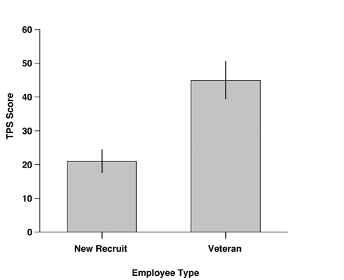
This gets the reader thinking about relative differences and absolute scores, which are presented in an accompanying figure.
Written by Edward Tufte
The Visual Display of Quantitative Information
Graphics Press, 1983
Visual Explanations
Graphics Press, 1997
Beautiful Evidence
Graphics Press, 2006
Written by William Cleveland
The Elements of Graphing Data
Wadsworth Advanced Books, 1985
Respect Your Reader
Keep the inferential statistics in the background. Some authors use a repetitive pattern in which the first sentence declares an effect significant and the second sentence describes the direction of the effect. This couplet is repeated for each effect. Here is an example:
Example 5
The logistic model predicting relapse was significant (LR x2(3) = 21, p<0.05). Level of social supports was found to be significantly related to substance use relapse (p<0.05). Higher levels of abstaining social supports decreased the rate of relapse. Joint diagnosis with internalizing and externalizing psychiatric disorders was significantly related to relapse (p<0.05). Subjects with both disorders displayed an increased rate of relapse. Age was also significantly related to relapse (p<0.05). Older subjects were more likely to relapse.
The style used in Example 5 is both a reflection and a perpetrator of the misuses of inferential statistics. The dominance of the p-value is at the root of concerns among analysts such as J. Scott Armstrong in the International Journal of Forecasting article “Significance Tests Harm Progress in Forecasting.” He argues that the practice of conducting significance tests should be abandoned. In extreme cases, the p-values’ dominance brings authors to forego describing the effect they are studying, because they emphasize the statistical significance to the exclusion of other statistics.
There is a style representing good statistical principles that is conciliatory between extreme views regarding significance testing and provides the most concise message without loss of information. This style, shown in Example 6, uses the text to describe the general patterns in the data and parenthetically provides either the p-value or a reference to a figure that contains the p-values.
Example 6
The hypothesized factors were found to jointly predict substance use relapse (LR x2(3) = 21, p<.001). Having a greater proportion of abstaining social supports increased the odds of being in the abstaining category three times (OR = 4.14, CI: 1.43–11.98,Wald = 2.62, p = .009). Conversely, the odds of remaining an abstainer were reduced by two-thirds if they had internalizing and externalizing psychiatric disorders (OR = 0.32, CI: 0.14– 0.74, Wald = −2.65, p = .008). Older subjects are less likely to relapse, such that the odds of relapse decrease by 25% for each one-year increase in age (OR = 0.75, CI: 0.58–0.99, Wald = −2.04, p = .042).
Use the Past Tense
The past tense is appropriate because the results section is supposed to be a description of what was observed in the particular study. The data are historical when published. Use of the present tense connotes an extrapolation beyond the data whereby the author is generalizing. Generalizations and the present tense are best left in the conclusions section.
Use CONSORT’s Outline
CONSORT is a consortium organized for the purpose of standardizing research reports for randomized controlled trials. The use of the CONSORT guidelines ensures important information is not omitted from the research report. An example of one of the standards is the requirement for standardized patient flow charts, which describes what happens to the subject pool between randomization and final follow-up. Another important CONSORT recommendation is to report confidence intervals for all parameter estimates. Many of the guidelines can be applied or adapted to a variety of study designs. Click here for more information about CONSORT’s recommendation.
Sequence Consistently
Consistently order the topics presented in each section of the paper, as consistency makes reading easier. Consistency of order should be carried out whenever there is repetition. For instance, in a series of tables and figures that contain the same independent variables, all the tables and figures should have the variables presented in the same order. An important exception is when ordering is used to communicate different results.
Eliminate Methods
What you did to get the results belongs in the methods section. The details of the statistical modeling are considered methods in most disciplines. Avoid reiterating the methods in the results section. Reference to the methods as an aid to orient the reader can be acceptable when the study is complex. Example 7 is adapted from The Scientist’s Handbook for Writing Papers and Dissertations.
Example 7
Salivary gland squashes probed with affinity-purified anit-75 antibodies showed the puffed regions of chromosomes had 52% higher fluorescence intensity (Figure 2).
Statisticians often know the data better than anyone else on the research team. The value of their contribution can be increased through a thoughtfully crafted communication style.


 (4 votes, average: 5.00 out of 5)