
Technological advances make time increasingly available as a dimension for data visualization. Historic developments in visualization, both animated and static, give a framework for thinking about current data animation. As described in A History of Data Visualization and Graphic Communication by Michael Friendly and Howard Wainer, the technology of visualization of time and space has evolved from sequences of still photographs through readily available tools for interactive data animation.
The photographs of successive positions of a galloping horse by Eadweard Muybridge from the 1870s correspond to arrays of two-dimensional data visualizations ordered by another variable, such as time. Muybridge used a device of his own invention to display such images in rapid succession, giving the viewer the illusion of motion.
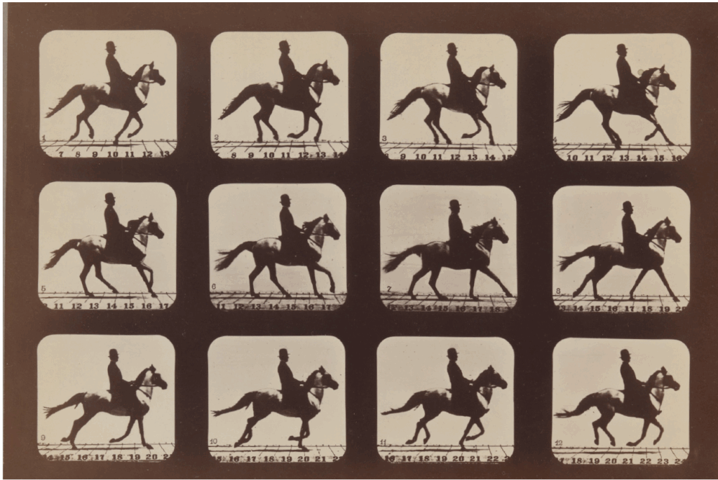
Motion pictures use time directly to represent a scene over time. Computer graphics enable the use of playback time to represent time in a data visualization. This gives the visualization designer access to an additional dimension and the viewer’s ability to detect motion and change over time. The frames can draw on the full range of techniques for static visualization.
Thinking of motion pictures as data representation raises some of the complexities that persist in computer graphics. The key feature from motion pictures that carries over to data animation is that the playback of the multiple images captured at different time points gives the viewer direct experience of the time dimension of the scene. The hue and intensity at space locations in a single frame of a multi-frame motion picture represent the projection of the value of light from a scene into two dimensions. Details of this relationship would involve a dive into the study of optics. Frame rate, shutter speed, ISO, and playback speed will also affect the information conveyed by viewing the motion picture.
Similarly, a data animation must address the assignment of data to separate frames, the representation of the data within each frame, and the transition from frame to frame. Periodicity in the scene or data may interact informatively or confusingly with the choice of frames, as in the changes in apparent rotation of wagon wheels in movies as the wagon changes speed, changing the rotation time of the wheels. In data animation, one might choose frames to emphasize or suppress a shorter-term cycle in favor of a longer one.
Moving into more abstract visualizations, the role of a time dimension is particularly clear for data sets having multiple cases each with two space coordinates (or projections of three space variables or fully three-dimensional spatial data with access to virtual reality technology) and a time coordinate. By analogy with motion pictures, each frame represents the spatial information for a specific period. As the frames are displayed in succession, the time at which a frame is displayed represents the time coordinate for the cases in that period.
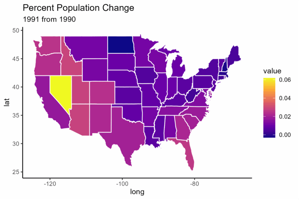
Animating a time sequence of choropleths for the same region and coloring principle illustrates this approach. Figure 1 shows a map of the United States with states colored by their annual percent population gain between 1990 and 1991. A map animation of such maps for 1990–2010 gives an overview of population trends over time, showing periods and regions of fastest growth, for example in the basic choropleth animation. The animation has other lessons. The colors don’t vary smoothly. One abrupt transition is eloquent; note the sharp drop in population in Louisiana in 2006, the year following Hurricane Katrina.
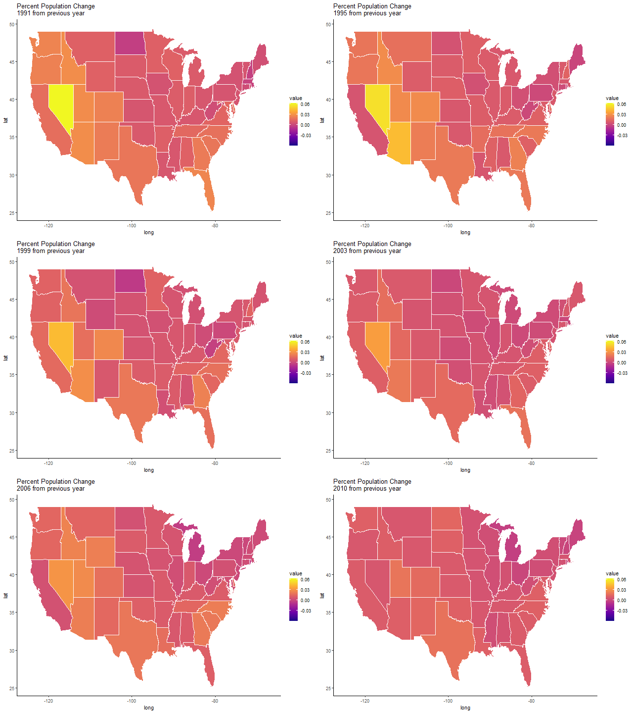
Overall, though, visual interpretability might be improved by mathematically smoothing or interpolating data to provide intermediate frames as in the smoothed choropleth animation.
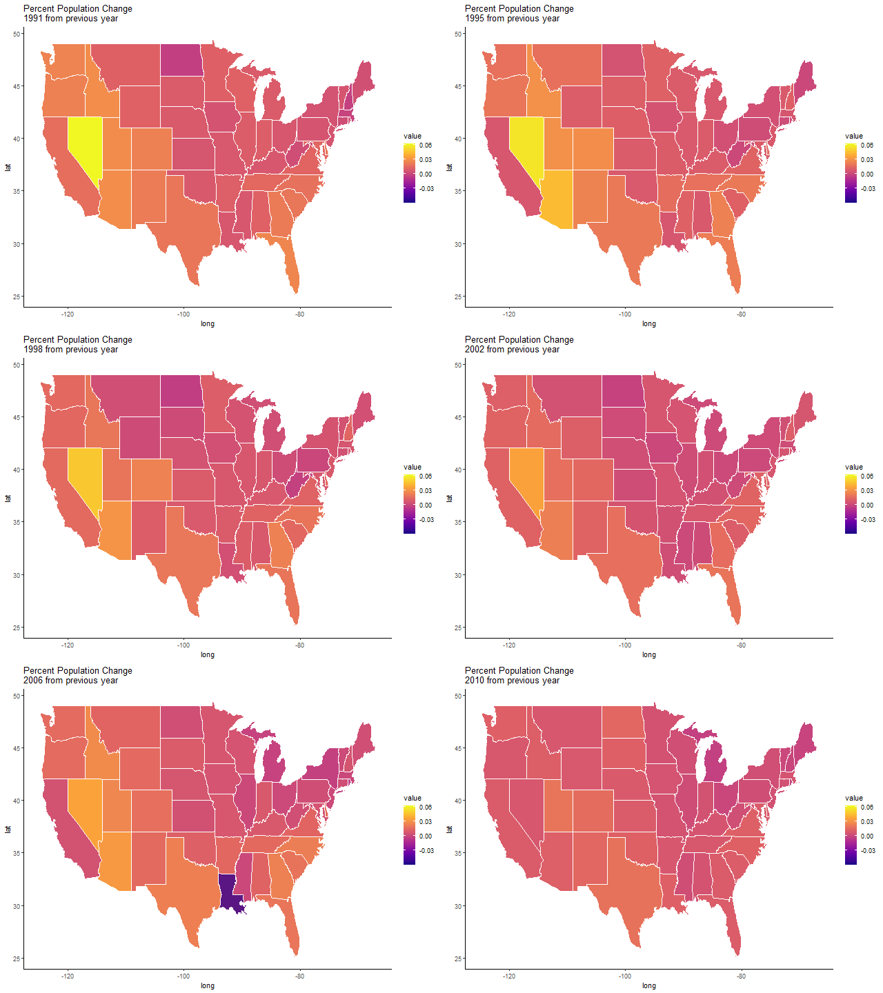
In general purpose animation, the creation of frames to smooth transitions between essential frames is called betweening or tweening. Easing—the degree of difference between the successive tweens as the transition progresses—gives the designer control over the apparent speed of the transition close to the beginning, in the middle of the transition, and toward the end.
A data animation can use pauses on frames directly drawn from the data to distinguish data values from interpolated values similarly to the way data points on a smoothed curve distinguish observation from interpolations.
Static data visualizations take a leap in flexibility with the representation of nonspatial variables using spatial coordinates. From there, using animation to represent data with a time coordinate and two or more other variables proceeds naturally. Each frame consists of a traditional planar representation of the non-time variables, while the time of display represents the time variable.
For example, a population pyramid can use space coordinates to represent population counts in age cohorts. For data with binary gender labels, back-to-back bar charts can represent counts in cohorts by gender category. Animating these visualizations with a frame for each year creates a population pyramid over time , giving a sense of the changes in population size and age distribution.
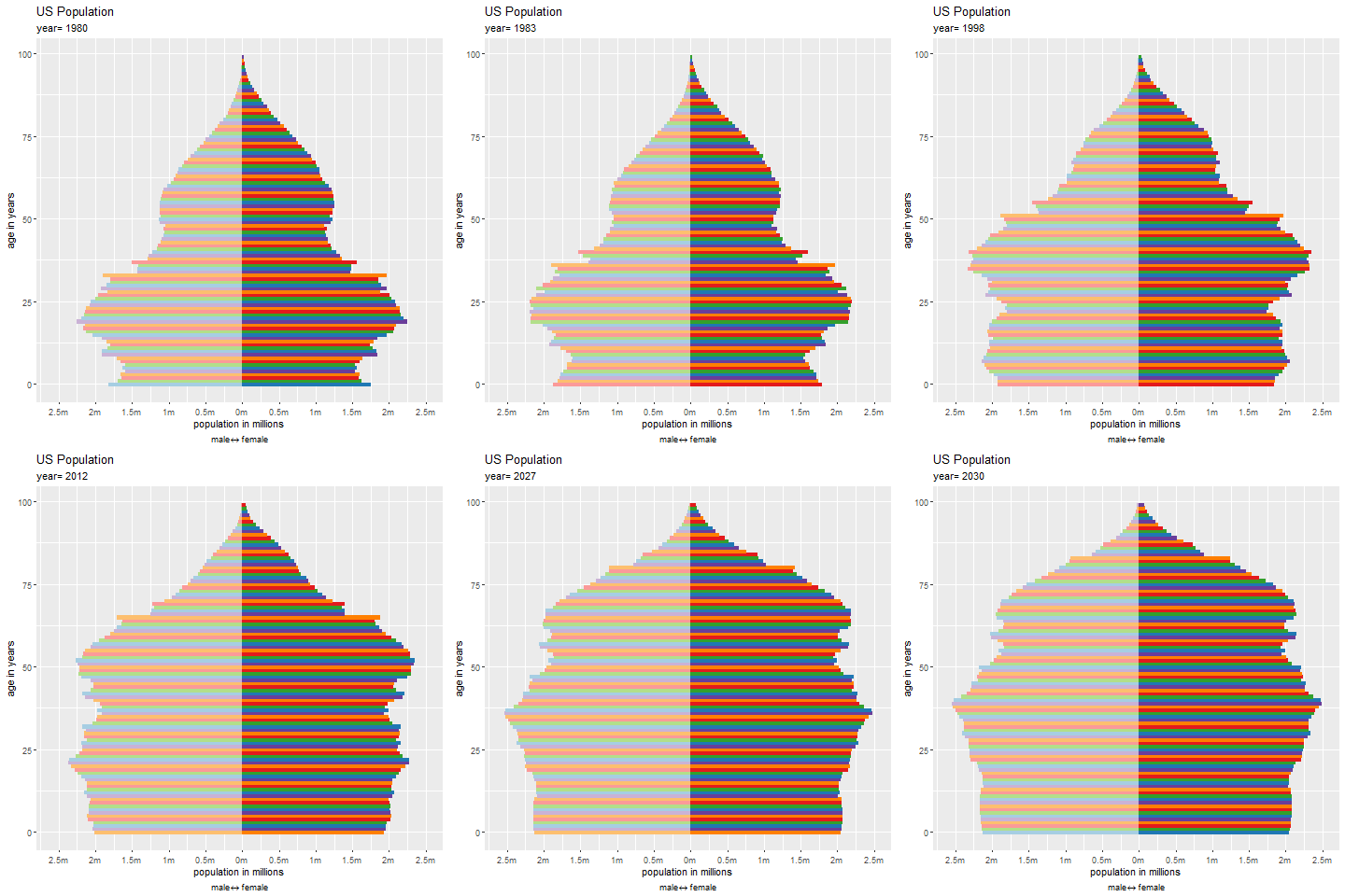
When an entity in the data is in different positions in different frames, the sense of an object in motion depends on mental connection of multiple images representing the same object in different positions. Continuity in the position may or may not be sufficient to allow the user to track the entity as the animation progresses. The designer may have to provide cues to identity.
In the population pyramid, a cohort of individuals—with additions and deletions—moves up the pyramid as the years progress. To facilitate tracking of a cohort, the hue of a bar acts as an identifier for the birth year, with repetition after 10 years.
For animations in which the construction of each frame includes a random component, the designer must take particular care to retain visual consistency. In the animation of voting agreement, the graphs show the degree of agreement in voting between members of the US House of Representatives from 1949 to 2012. The vertices for each period correspond to members of the House and positioned using a linear-attraction, linear-repulsion model.
Proceeding by analogy from the visualization of nonspatial data with spatial coordinates, animation allows for the display of a nontemporal variable along a time coordinate. For example, the scatter plot animation at displays successive cross-sections in the v3 direction of a simulated data set with variables v1, v2, and v3. The frames are scatterplots in the v1 and v2 values. Thinking about this carefully raises the question of time slices. If the v3 values come from a continuous variable, just displaying the scatterplots for each occurring value of v3 may result in sparse plots. In the case in which no v3 value is repeated exactly, each frame will contain a single point. The designer must consider how wide a v3 interval should contribute to the plot in each frame (shutter speed), whether position within this interval should be represented in the visualization (ISO, how fast a stimulus produces an effect of what size in a camera), and the extent to which past data should persist and future data should be prefigured.
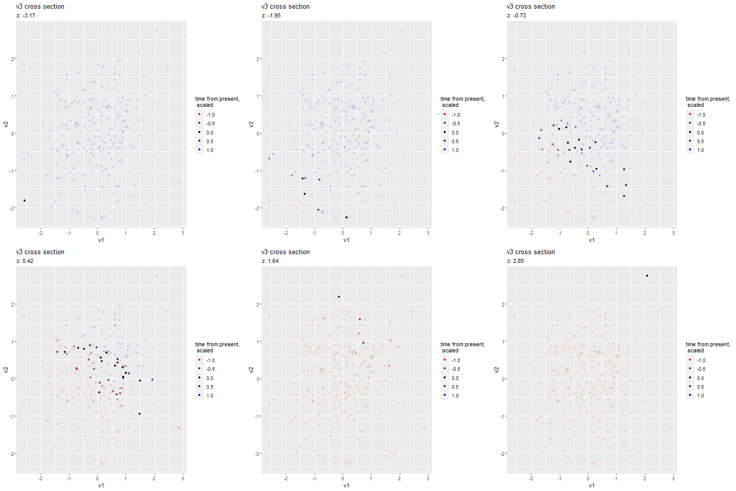
Here, instead of thresholding the width of v3 displayed in each frame, older points are distinguished from newer points by color. Points close to the center time are more opaque than points from the future and past, but points persist throughout the animation. The viewer sees the v1 and v2 cloud move generally up and to the right as v3 increases.
Aesthetics used to indicate position in time should be distinct from aesthetics used to convey other variables. For example, if each case in the data represents an individual’s score on four behavior scales and x position, y position, and color of the point represent an individual’s score on three of the scales while time is used for the fourth, the color of the point shouldn’t be used to indicate its position relative to the center time.
In movies and in data animation, the designer has flexibility in the relationship of the true time or time-like value to the playback time. Slow motion photography and time lapse photography illustrate this for motion pictures. The collector of the data and the data analyst will also make choices about the length of the interval between observations. In data collection, the question of the intervals at which to sample the data (e.g., annual observations of demographics or millimeter slices in medical imaging) corresponds to the frequency with which separate frames are captured with a camera. The designer may introduce a nonlinear relationship between playback time and the variable, call it t, represented by time. For example, intervals in t in which the remaining variables change rapidly with respect to t may be traversed slowly, while regions with little change may be traversed more rapidly, corresponding to slow motion and time-lapse movies.
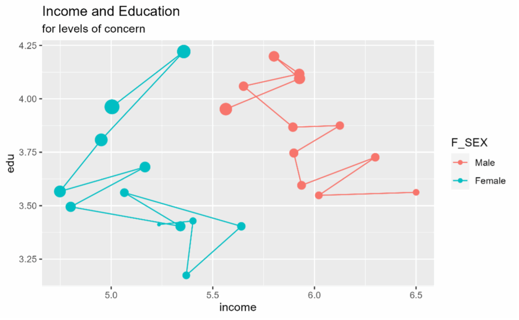
Retention of data from smaller values of t can give a sense of the trajectory of the phenomenon being studied. Several aspects of poll data inform the animation of opinion and demographic data. The time variable represents the mean degree of priority given by the respondent to issues of high priority to self-identified “very liberal” respondents. The x-axis represents education level. The y-axis represents income category. The dots are positioned at the averages for respondents with each level of mean priority. The radii of the dots represent the proportion of the population estimated to have that priority value. The responses are separated into binary gender categories, indicated by color and segment connection. While the end point of the animation shows the values for all mean priority values, the animation allows the viewer to associate the values of income and education in each category at each level of mean priority without having to trace the sequence manually.
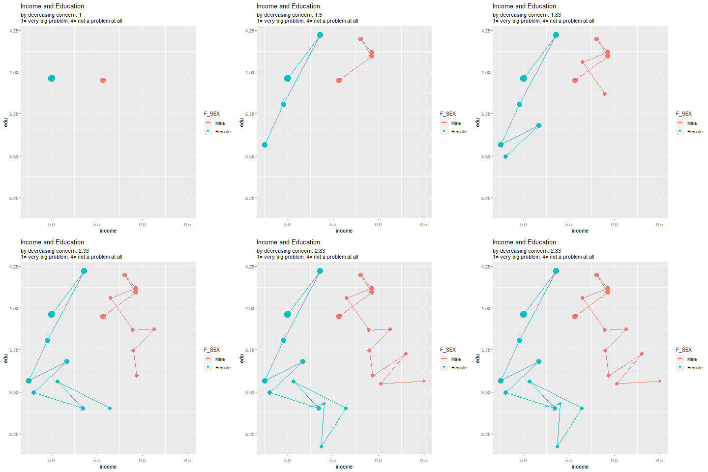
Departing from the movie paradigm and treating the time variable more symmetrically with other aesthetics suggests other features a data animation can use. Interaction allows the designer to leverage the user’s sense of the control mechanism to increase the intuition that can be gained from the visualization. User control of playback speed and time gives opportunities for interaction comparable to controlling the scale and interval on a spatial axis.
For example, for two-dimensional projections of three-dimensional scatter plots, giving the user the ability to physically manipulate the choice of the projection axis in real time enhances the user’s sense of the situation in three dimensions. As the user does this, the user essentially creates an animation. Allowing the user to run the animation forward and backward at different speeds provides the time axis analog of the ability to focus on a particular region in a static visualization.
These descriptions are not exhaustive, and human ingenuity abounds. I trust current and future data animators will use innovative methods to expand our ability to gain intuition from data.

Catherine Durso is a consulting statistician for research at the University of Denver and a teaching professor in the computer science department. She can happily putter for hours on a data visualization.
Leave a Reply