It is practical in many applications to visualize data in a way that maintains its spatial context. However, maintaining spatial context while visualizing the relationship between two variables is difficult, especially when the variables occupy the same spatial domain. Certain design choices increase the difficulty of interpreting these visualizations, potentially leading to longer graph comprehension times and an inability to correctly discover patterns.
With a projected increase in future crop demand, researchers have been conducting experiments (called on-farm precision experiments) to examine the effect of crop input application on yield to inform more sustainable farming practices. During these studies, researchers collect multiple pieces of data on the same field and store them in a shape file—a common file type for geospatial data. These pieces of information include the following:
Experimental Design: Usually a Latin-square-based design, where the shape file contains the target crop input application (treatment) rate and locations on a farmer’s field where they should be applied.
As-Applied: Treatment rates a tractor applied to the field and application location. These rates differ from the experimental design due to sensor errors and machine limits of planters.
Yield: After the growing season, obtain crop yield measurements and their measurement location.
The data used in the visualizations in this article is a small example of the kind that would be collected and analyzed in one of these agricultural field experiments.
In this application, it is beneficial to visually explore the collected data to see how yield responds to different treatments across the field. Hence, when displaying this data, it is important to maintain spatial context, as yield can vary spatially due to variables such as soil content.
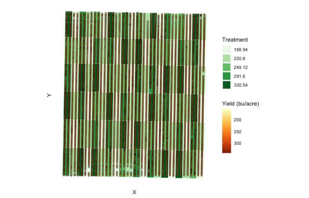
Figure 1: Original superimposed graph where the yield measurements (circles) lay on top of the experimental design (rectangles). This plot has issues with clutter due to the overlapping yield measurements.
Current Sub-Optimal Visualizations
A common method to visualize two variables in the same space is a superimposed comparative layout. Figure 1 is a re-creation of a superimposed graph typically used to display the relationship between treatment and yield in agricultural literature. Here, the yield map is superimposed on top of the experimental design. The colored rectangles represent the experimental design, with the different hues denoting the planned treatment rate. The overlaid yield information includes circles representing the measurement location and yield amount through its color.
One perceptual concern in Figure 1 relates to the yield circles. The circles overlap, obstructing the visual cue of color and adding difficulty to determining the number of yield measurements. Because of the color obstruction, users may incorrectly evaluate the relationship between the variables through space. Issues stemming from clutter are common drawbacks of superimposed layouts.
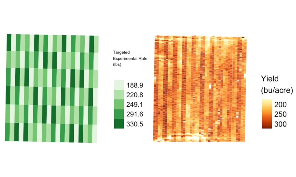
Figure 2: Original juxtaposed graph where the experimental design and yield measurements are placed side-by-side. In this visualization, the comparative burden is placed solely on the user, adding to the difficulty in interpretation.
Figure 2 is another representation of the same data using juxtaposition. A juxtaposed layout places the experimental design and yield data side-by-side. In contrast to the superimposed layout, this visualization does not have issues with clutter. However, juxtaposition places most of the comparative burden on the user’s memory. Due to the user’s eyes shifting focus between images, they rely on a mental image for comparison. Unfortunately, the mental image might not form accurately in their working memory. Furthermore, users must identify corresponding regions in both plots and assess their correlation. These are demanding tasks that can result in incorrectly extracting the variables’ relationship.
A common concern in Figures 1 and 2 is the color schemes. The chosen color scheme for this application uses green gradients for an experimental trial and a yellow-orange-red gradient for yield. Red-green color blindness is experienced by about 8% of men and 0.5% of women with Northern European ancestry, according to the Nature Methods articled titled “Points of View: Color Blindness” by Bang Wong. Those affected have difficulty discriminating between these colors and other colors containing a component of these colors, leading to potential errors when deriving relationships. So, when creating a visualization, choose colors more strategically to make them accessible to larger groups of users.
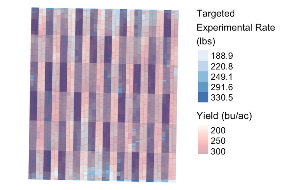
Figure 3: The first step in the redesign process maintained the superimposed layout but introduced non-overlapping polygons and transparency for color blending.
Suggestions for Improvement
We began with a superimposed layout, so users can use their perceptual system rather than relying on their memory. This layout is also generally recommended when data occupies the same space, as the user does not have to identify the corresponding regions for comparison.
To address the overlapping circles for yield, we transformed the circles into non-overlapping polygons using the distance between points, swath width, and harvester direction. The individual polygons were too small for users to extract information efficiently, so we combined them into larger polygons, calculating the average yield within each combined polygon. The yield information no longer overlaps, so its color is no longer obscured. We blended the colors of the new yield map with the experimental design using transparency. Hence, users assess the relationship through the blending of colors for yield and treatment.
We also addressed the problematic color scheme by maintaining the red gradient for yield but using a blue gradient for treatment. An example of this plot is found in Figure 3.
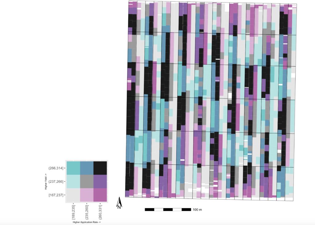
Figure 4: The bivariate color map is an alternative to color blending, where each variable is separated into categories to create a color scale.
While Figure 3 addresses perceptual issues, using color blending to derive a relationship through space is difficult. To further address these challenges, we used a common alternative to color-blending called a bivariate color map. This type of visualization can be informative if the relationship between variables is more important than individual values, according to the Cartographic Perspectives article titled “Operationalizing Trumbo’s Principles of Bivariate Choropleth Map Design” by Georgianna Strode and coauthors.
We used quantiles to separate both variables (treatment rates and yield) into low, medium, and high categories to create a 3×3 color scale. A larger scale hinders interpretation due to the number of colors.
Since the focus is on the direct relationship between variables, the diagonal of the color scale uses a grayscale color scheme. The upper and lower triangles have complementary color schemes to show their separation.
The field is broken into polygons, where its color is determined by the average yield and average treatment found within that polygon. The outline of the trial plots from the experimental design is maintained to provide additional spatial context.
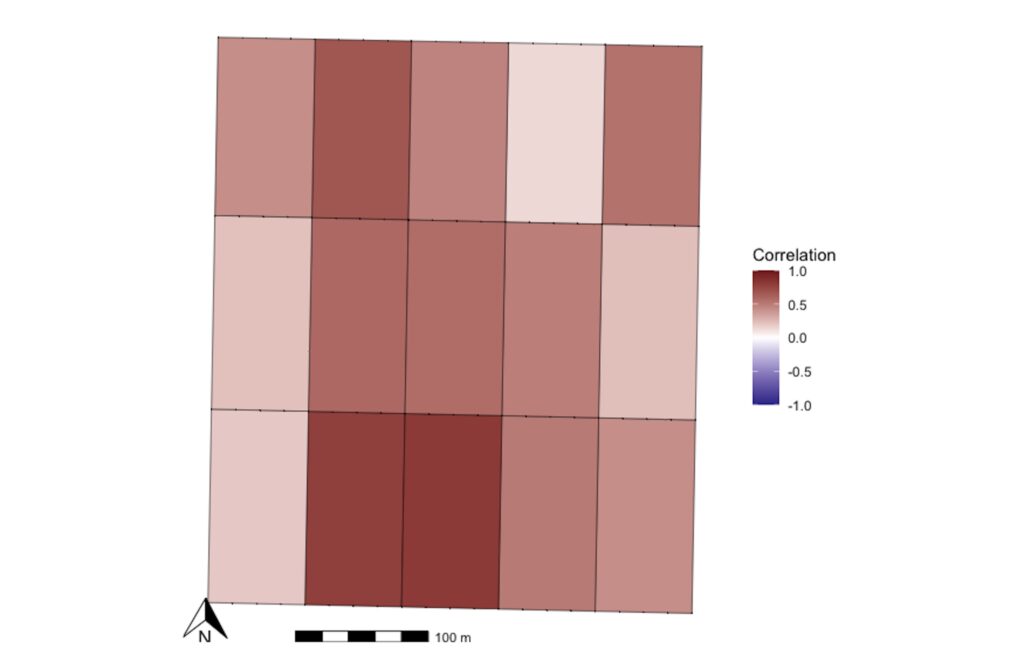
Figure 5: A plot that states the correlation between treatment and yield using an explicit encoding layout.
Although the polygons along the diagonal (positive linear relationship) stand out, this visualization is limited due to how we divided the data into only three categories due to working memory limits. Therefore, each category covers a wide range of values.
Additionally, when looking at Figure 4, the yield measurements of 237 bu/acre (low yield/low treatment) and 238 bu/acre (medium yield/low treatment), for example, are represented by different colors while only having a one-unit difference. The different colors may perceptually make the observations seem more distant than they are. Finally, the user derived the relationship between the variables until now. To reduce their cognitive load, we used an explicit encoding layout, which directly displays the encoding of a relationship between variables. We wanted to directly encode the correlation between the variables in the visualization.
To maintain spatial awareness, we calculated the correlation between the as-applied treatments and yield in different field sections, outlined by black boxes. A diverging color palette was chosen to account for both the magnitude and sign of correlation values. Due to the common cultural associations of red with warmth and blue with cold, we used a red gradient for positive correlations and a blue gradient for negative. Figure 5 is an example of this correlation plot.
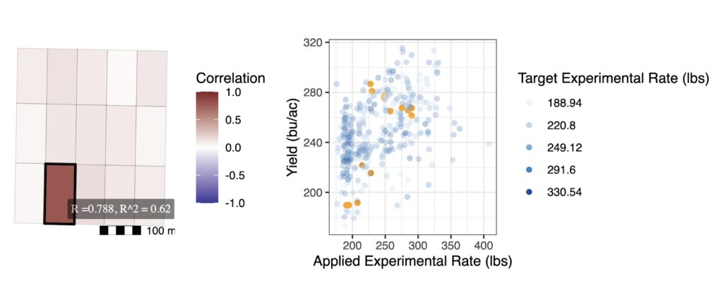
Figure 6: Screenshot of the interactive plot that overcomes the weakness of Figure 5 by including the values used in the correlation calculation.
Although Figure 5 directly provides the correlation to the user, it is difficult to connect the correlation back to the data. This is problematic, as a standard principle of data visualization is to show the data. To overcome this weakness, we used a hybrid layout. A scatterplot displaying the as-applied treatment versus the yield was juxtaposed with the previous correlation plot. Interactivity connects the plots, where hovering over a section in the correlation plot highlights the corresponding points used in the scatterplot to calculate its correlation. While interactive plots are not beneficial in static PDF reports, they can be advantageous in online tools designed to help farmers explore their data.
In the Future …
Future steps in this project will aim at obtaining user feedback to measure which proposed visualization is more suitable. Part of this will include testing user accuracy in estimating the relationship between variables in the current sub-optimal graphs versus the different iterations of the proposed graphs. For more information, review the code for the eventual corresponding paper this article is based on.
Editor’s Note: This work was completed under the direction of Susan VanderPlas.
Alison Kleffner
Kleffner is an assistant professor at Creighton University. Her research focuses on spatio-temporal modeling and visualization in environmental applications.
Thanks for the author for highlighting challenges in visualizing multiple variables in the spatial context.
I wonder if applying Gestalt principle to design the visualization could help.
Here is a previous paper where the authors shows examples of visualization in the spatial genomics literature.
Guo, B., Huuki-Myers, L. A., Grant-Peters, M., Collado-Torres, L., & Hicks, S. C. (2023). escheR: unified multi-dimensional visualizations with Gestalt principles. Bioinformatics Advances, 3(1), vbad179.


Thanks for the author for highlighting challenges in visualizing multiple variables in the spatial context.
I wonder if applying Gestalt principle to design the visualization could help.
Here is a previous paper where the authors shows examples of visualization in the spatial genomics literature.
Guo, B., Huuki-Myers, L. A., Grant-Peters, M., Collado-Torres, L., & Hicks, S. C. (2023). escheR: unified multi-dimensional visualizations with Gestalt principles. Bioinformatics Advances, 3(1), vbad179.
https://academic.oup.com/bioinformaticsadvances/article/3/1/vbad179/7459905