
Much of the existing guidance on data visualization design is based on practitioner opinion, and those opinions can be challenging to wade through. Some recommend minimalism, while others recommend catching your audience’s eye with flashy colors or a catchy title.
Expert opinions are informed by years of practical experience designing data graphics and sharing them with audiences. However, they do not give us data-backed findings on how different elements of data visualization design affect a general audience’s interpretation of the information conveyed, nor do they inform us about how different audiences interact with data graphics in different ways.
There have been many user studies on graphical perception that aim to do just that—provide data-based research on elements of data visualization design. The majority of these studies focus on the form of a data visualization and the mapping of values to a scale: Is a bar or pie more effective for faithfully representing the relative relationship between two values? How does changing the range of a Y axis distort a viewer’s estimate of the severity of a trend? How small of a difference between two percentages can viewers perceive in a bar chart?
These are important questions to study, but they do not tell us how to design a data graphic: How should groups or categories be arranged to facilitate pattern identification? What level of detail in axes, labels, and legends is helpful without overwhelming a viewer? What patterns do viewers focus on when they look at a data graphic? Does viewer behavior and interpretation differ across demographics? The latter is a particularly poignant question to consider, as many prior graphical perception studies use convenience samples, often with highly educated participants.
We Asked US Adults
Nola du Toit, Ed Mulrow, and I collaborated with Heike Hofmann from the University of Nebraska-Lincoln to answer these questions using surveys. Over the course of several years, we fielded survey items to nationally representative samples of around 1,000 adult respondents to study how the US public interacts with and interprets data graphics. We varied the form of the graphics shown, context provided, and questions asked, but we showed the same data set throughout.
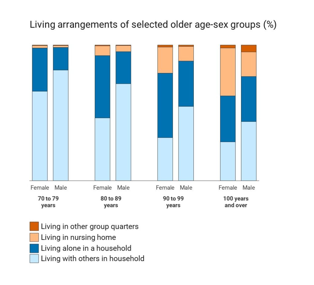
We first asked people to assess which element was larger out of two elements with similar magnitude. Aligning the elements in question, providing context-like grid lines, and directly identifying the elements of the chart needed to make the comparison increase viewers’ ability to assess the relative size of two elements.
When we directly marked the pieces in the chart shown and asked participants to identify which of the two marked pieces was larger, the rate of correctly identifying the larger piece was significantly higher than when we asked participants to, for example, identify whether “the percentage of 80–89-year-old females living alone in a household” or “the percentage of 90–99-year-old females living alone in a household” was larger. From these findings, we know visually emphasizing elements within a chart you want viewers to compare and making sure those elements share a scale and baseline, improves viewers’ ability to correctly make comparisons.
We also asked participants to directly tell us what they saw, saying “Please tell us in your own words: How would you summarize what this chart shows about the living arrangements of selected older age-sex groups”? Their answers, unsurprisingly, varied greatly.
Some participants picked up on the increase in the percentage of adults living in nursing homes in older groups, with varying interpretations of that pattern:
- “It shows that the older you get, you are more likely to end up in a nursing home.”
- “Old people end up in nursing homes eventually.”
Other participants picked up on differences between the male and female groups, responding:
- “Elderly women are more likely than elderly men to end up living alone.”
- “Women are more likely than men to live in nursing homes or other group quarters as they age.”
- “Women are more likely to be independent in old age.”
Some focused on the magnitude of those living in a household:
- “[O]ur elderly are either living alone or with family.”
- “Very few elders live in nursing homes and group quarters. Most live alone or with others.”
- “[A] majority of people either live with others in their household then start to live alone.”
All the above responses are based on observable patterns in the data graphic shown; however, they each focus on only one pattern or comparison. Respondents, for the most part, identified one key takeaway to share and shared the takeaway that stuck out most to them upon looking at the chart. For some, however, this takeaway or interpretation was unsupported by the chart or they simply shared their opinion of the chart itself (e.g., “It sucks.” “Pie chart would be clearer.” “Seems inaccurate.” “I don’t like it.”). Some respondents also tied the graphic back to the implications of aging in their own life or related it to personal experiences with themselves or family members.
In addition to the variability in the content of responses, we observed differences in how participants engage with the open-ended interpretation questions. There were noticeable differences in engagement with the chart and content of responses across demographic groups, with higher-education groups spending more time and providing longer responses about what they learned from the chart. We also observed a higher prevalence of pattern-oriented language—words such as “more,” “higher,” “older” “likely,” “than”—in higher-education groups, potentially due to a higher degree of familiarity with data visualizations among those with advanced degrees.
What Does This Mean for Designing Data Visualizations?
Our main recommendation so far is as follows: Make it easy for your audience. Design your data graphics to visually emphasize the specific comparisons or pattern you want your audience to focus on.
No matter how much we, as data professionals, want to think of data visualizations as displays of objective information, every design choice has an impact on how viewers process information. Therefore, it’s important to consider what the most important comparisons or patterns are and design your data visualization to facilitate viewers identifying these key points. This can be done in many ways, including grouping elements according to a high-level pattern, aligning visual elements when viewers should compare their relative sizes, and clearly labeling chart elements.
Moreover, think about who your viewers are; different audiences may experience data graphics in different ways. Every viewer will bring their own experiences, opinions, and perspective when they view and digest the data shown in a chart.
When communicating information to a group less familiar with complex data visualizations, default to simpler structures. Don’t crowd graphics with more than one message or finding and try to reduce the possibilities of how a chart can be read or interpreted by providing context and example interpretations and keeping the scope of the chart narrow.
Visualizations are a powerful tool and, when carefully designed to meet your audience where they are, they can provide critical insights about your data.

Kiegan Rice is a senior statistician at NORC at the University of Chicago specializing in static and interactive data visualization, reproducible data analysis pipelines, and scientific communication. She applies her skills to multiple research areas, including education, health care, and public health policy. Rice earned her PhD in statistics from Iowa State University, where she studied statistical and computational reproducibility in forensic evidence analysis.
Deep Dive
For a deeper look at the survey discussed in this article, read “Testing Perceptual Accuracy in a US General Population Survey Using Stacked Bar Charts” in the Journal of Data Science.
Leave a Reply