
In 2018, my first book, Data Visualization: Charts, Maps, and Interactive Graphics, was published in collaboration with the American Statistical Association. The textbook market was already saturated with data visualization books at that point, and it actually took a while for my editor to convince me to write it at all! The aspect that won me over was that the audience included young scientists and students who might be considering a career in statistics. In the years that followed, I found myself continuing that theme of engaging with people who are new to communicating statistical outputs, no matter their age.
Most people in statistics, including me, were taught a lot about calculation and not very much about communication. Yet, as we all know, it is sadly all too common for good analyses to gather dust on the shelf—and fail to influence decision-makers—simply because the communication was not engaging enough. So, those critical communication skills are in short supply, and anyone who can demonstrate their abilities is liable to stand out from the crowd.
One of the most common grumbles I hear from clients is they struggle to recruit effective communicators into their data teams. A client once asked me where he could find an effective communicator and I responded, “I don’t know, because we don’t learn this in stats school, we acquire these skills in the workplace.”
The Translator Role
When I wrote Data Visualization, job titles like data analyst and data scientist were somewhat fluid between organizations. Now, it seems clearer: Data analyst jobs focus on summarizing data, producing reports and dashboards, and answering quick-fire requests, while data scientist jobs involve managing pipelines of data from storage to query or model, or creating the models themselves for prediction or causal inference.
There is still little mention of the “translator” role, suggested in 2015 by Thomas Davenport in a blog post for Deloitte Consulting, alongside “light quants” (data analyst) and “heavy quants” (data scientist, statistician, machine learning engineer). In a software development environment, the translator is more likely to be called a product owner, whose specific responsibility is interfacing between the client, or boss, and the developers. They must define what success looks like for the project and check that it delivers value. This is central to effective statistics and links to all the steps taken for good data visualization. Let’s consider how it fits into the statistics workflow.
Partners, Not a Help Desk
The analysis can only deliver value if it answers the question the audience has. Someone must identify that question and map it to specific statistical goals. Often, the audience (e.g., your client, boss, or colleague) does not know how to ask for specific statistical goals and translation is needed. We are there to help them do this, as partners. They understand how they want to use insights from the data and we understand various tools for extracting insights.
Sometimes, what they ask for might not be what they need most; it may be what they are accustomed to receiving or what they have heard others in the field are doing. They may expect asterisks for statistical significance when perhaps what they really need is a Bayesian posterior probability of an outcome being over or under some threshold. They may ask for a meta-analysis of previous A/B tests, when what they need is a multilevel regression prediction for a specific new scenario already being rolled out.
By taking time to first identify what they really want to be able to do and how they intend to use insights from data, we can help them get the most valuable information. This needs delicate collaboration, and as my years of consulting have gone by, I have become more convinced of this provocative motto: Statistics is an interpersonal skill.
You may need to do considerable work over a long period to shift the relationship from help desk to partnership. The help desk mind set is characterized by expecting rapid responses that directly answer the question without further conversation about it. To be clear, there are times when urgent action is needed and rapid responses are justified, but they should not be the norm. It will be more useful to your audience in the long run to make this change.
In data visualization, this shift in the relationship allows us to adapt our graphics to meet the needs of the audience. An image that directly answers a question—that delivers value, not just eye candy on top of the analysis—is one that will be used. The same is true in private, public, and charitable sectors.
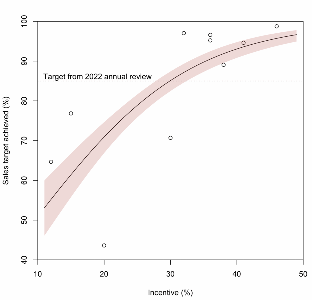
At the same time, you need to maintain some control over the image and how it is used. Adding critical annotation can help contextualize the image. In the graph of “incentive” and “sales target achieved” (invented data), we can see a horizontal dashed line dropped over a prediction from a logistic regression model, inviting the audience to compare predicted results to a “target from 2022 annual review.” This kind of annotation can help put numbers in the context of team goals and organizational priorities.
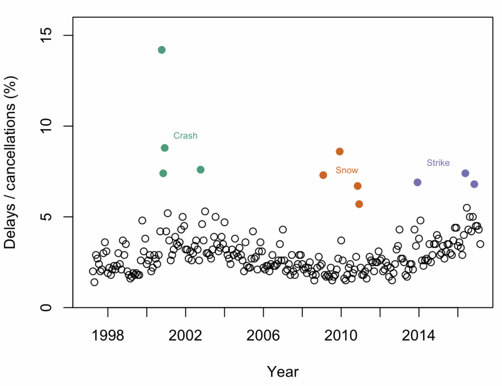
In a graph showing a time series of railway delays and cancelations around London, we can see a general, slowly undulating trend and some outlier periods when there were many more delayed or canceled journeys. If we want to acknowledge the outliers and show they are fundamentally different from the rest of the data, the best way to do it is by direct annotation. However, we must be careful not to add too much clutter, or “chartjunk,” the enemy of effective visualization.
Another reason to annotate the graph is that if it is screenshot and used in someone’s slides elsewhere without your involvement, the annotation comes along for the ride. Captions can easily be left behind in this way, not to mention lengthy footnotes and methods sections. Make the context and caveats as interesting as the bottom-line message. They are often critical to good decisions.
An Analytical Sandwich
Our work is sandwiched between the data source and audience. We do not generally collect the data, so we must find out what challenges might be hiding in it. These may constrain our analysis choices and our visualizations. Suppose you work for a supermarket chain and must analyze transaction data from the last five years. The data warehousing team can set you up to query the historical data and obtain neat data files.
However, by talking to them, you learn database definitions changed three years ago. The impact of that is the rate of some transaction types suddenly increased, while others dropped. This is not a true reflection of what’s going on, but a data management artifact. You can adjust for this in some way, or you can annotate it in your outputs, and that choice will depend on the other end of the sandwich—your audience’s needs.
If the decision-makers need to predict the volume of transactions by type, you would be wise to adjust for this artifact by some model or restrict the data to the most recent. Either way, this needs to be noted in the output, and therefore the visualization. If there are multiple models for adjustment, or options for cleaning, they should perhaps be shown, too, for full transparency and sensitivity analysis.
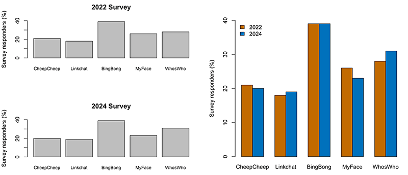
On the left side of the bar charts, we cannot see whether a particular (fictitious) social media platform has gone up or down in popularity, but on the right, when we put them on a common baseline and next to each other, it is trivia.
Another consideration is the statistical literacy of your audience—not just numeracy, but their ability to digest statistical jargon and reason with data and statistics in their decision-making. For less statistically literate decision-makers, we need to go further in summarizing and guiding the decision. Of course, we must be careful not to hide uncertainty.
Even for more engaged decision-makers, there are occasions when little time can be given to the output of your analysis. Especially in long, multifaceted meetings, where your work will be presented alongside many other items, it is a good idea to be prepared with a long and short version of your presentation, just in case you get trimmed—and that includes the visualizations.
Evergreen Tips
Now, let’s reflect on some of the tips I have been providing to training course participants. Even when the client asks for a session as short as two hours, there is still a lot that can be conveyed to improve everyday data visualization.
- Make sure the visual objects you want the audience to compare are close to each other. Related to this, there should be a common baseline, whether that is a horizontal or vertical line or some other aspect of the image. On the left side of the bar charts, we cannot see whether a particular (fictitious) social media platform has gone up or down in popularity, but on the right, when we put them on a common baseline and next to each other, it is trivial.
- Make sure color schemes are compatible with house style, are color blindness friendly, and will survive black and white printing. You can generate color schemes with websites like colorhexa.com and colorbrewer2.org (the trains outlier chart above used colorbrewer colors). Lisa Charlotte Muth’s blog post colors will take you deeper into understanding color schemes.
- Reduce clutter by linking elements. When our brains see two objects of the same color in an image, we assume they are linked. This is reinforced by proximity, and these are examples of “Gestalt principles,” which are a valuable source of ideas for simplifying your images while still clearly conveying information. This is what happened with color and proximity in the train outliers scatterplot.
- Use attributes such as shapes or color consistently throughout your entire presentation or report. Once the audience has learned how to read one graph, don’t make them do it all over again.
- Consider adding a “how to read this graphic” introduction. This could be a paragraph, a video, or a little time in a presentation in which you walk through one example of examining a data point or aspect of your visualization.
- Remember a visualization is not always the right choice. A single percentage can be a short, impactful sentence and may carry more weight than a pie chart (for example).
My clients and learners are often keen to expand their repertoire of software. However, I think the software you use is not as important as the design and interpersonal skills you bring to it. For statisticians, I suggest you learn one fast package for sketching and trying out ideas (e.g., Tableau, the R package ggplot2, or the Python package seaborn) and one flexible programming language that lets you drop shapes, curves, and polygons where you like. This combination will let you craft your charts without constantly struggling to keep up with the latest fashion in software.

Robert Grant is a freelance statistician based in Winchester, United Kingdom. His clients have included the World Bank, UK Cabinet Office, Harvard Medical School, and The Economist. He has written two books: Data Visualization: Charts, Maps, and Interactive Graphics and the forthcoming Bayesian Meta-Analysis: A Practical Introduction.
Leave a Reply