
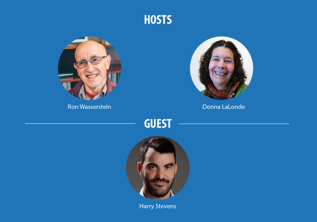
This interview with the ASA’s 2024 Excellence in Statistical Reporting Award honoree, Harry Stevens, Climate Lab columnist at The Washington Post, was conducted by Practical Significance co-hosts Donna LaLonde and Ron Wasserstein during a recent episode in which they discussed what drew Stevens to data journalism and how it has evolved. He explains his approach to navigating the sea of complex data available today, focusing on identifying truly significant stories. He also talks about the software he relies on for data collection, analysis, and “cool” visualization and takes out his crystal ball to look into the future of journalism and the impact of artificial intelligence.
[I]t’s easier to get good at something when you are having a good time.
Harry Stevens
Donna LaLonde: Harry, please introduce yourself and tell us about your day job.
Harry Stevens: My name is Harry Stevens, and I am the Climate Lab columnist at The Washington Post. I write a regular column about climate change and the environment—or the natural world—that analyzes data and presents it with cool graphics.
For example, a story will be about how average winter temperature has changed in your town. And so, it’ll be an analysis of high-resolution, gridded temperature data over time. And then it’ll feature a map that’s colored according to that change. But then I also like to include tools where you can put in your hometown, and there’ll be a database of like 50,000 towns and cities in the US that pretty much covers every place in the US, and it can tell you how your town has changed.
And, so, it’s a nice way to connect with the data. A lot of the stories let people personalize their understanding of the data, but then I also write various stories about interesting trends in the climate or the natural world and try to present it in a way that’s accessible and hopefully cool looking, too.
Donna LaLonde: What drew you to data journalism, and how have you seen the field evolve since you got started?
Harry Stevens: My first real engagement with data-driven journalism was in the 2008 presidential election. Nate Silver launched his blog, FiveThirtyEight. This was before it had been acquired by The New York Times or had launched its own website. It was just an interesting way to look at the election, because there’s so much punditry around presidential elections and people making informal predictions and forecasts all the time without having any statistical or objective reason to believe what they’re forecasting.
And, oftentimes, people evaluate the likelihood that a forecast will come true based on how confident the pundit asserts their position and very rarely go back and check to see if they got it right later. And what I loved about FiveThirtyEight was that Nate Silver was trying to rigorously forecast the election in every state using polls. But he was also—and this continues to be true—a very shrewd critic of the media, making some of the arguments I just alluded to about the way pundits make these forecasts without really doing much deep analysis or being held to account later.
This appealed to me that there was this new way of looking at these things that I cared about, where people were trying to rigorously question the assumptions the experts held and trying to see if they were true. So that was just a really cool way of looking at the world to me.
And, at the same time or shortly thereafter, The New York Times started doing graphics in JavaScript, which probably sounds kind of abstruse and weird to a lot of people if you’re not familiar with the web and how graphics are presented on the web. But, for a long time, interactive graphics were done with Flash, which was a separate software.
In 2012, The New York Times started making these very cool interactive graphics that had things moving on the screen. They did this one thing about the budget where it was a force-directed layout that was showing different budgetary categories as circles, and they bounced off each other with collision detection. So, they were kind of bouncing around on the screen. And it turned out that all this stuff—I didn’t know at the time—was being created with this JavaScript library called D3.js, which was created by Mike Bostock. He’s a software engineer, and he worked for The New York Times graphics department for a little while.
But that JavaScript library has totally revolutionized the way visual information is presented on the web and made it possible for people to make all kinds of very cool things. The combination of the statistical analysis and then the presentation graphics really came together for me.
Ron Wasserstein: Is JavaScript still your go to? Are there other software programs?
Harry Stevens: JavaScript is awesome, particularly for doing graphics on the web because it just runs natively in web browsers, so you don’t have to compile any code. It’s not as good at data analysis. I’ve been doing a lot of math with gridded meteorological data, and JavaScript isn’t as good of an option.
I use Python for data analysis. It’s really fast and pretty easy to use. My first love is really JavaScript, but there’s no perfect tool; it’s nice to have options.
Ron Wasserstein: You were recently honored with the American Statistical association’s Excellence in Statistical Reporting Award, which recognizes members of the media for their presentation of the science of statistics and its role in public life. With so much data available these days, how did you get drawn to the stories that really matter?
Harry Stevens: It helps to start with, “What will the headline of this be?” That helps you focus on a topic or a story that’s narrow enough that you can describe it quickly, like in a single headline. And it makes you focus on what will be interesting to the average person. Imagine yourself scrolling through your social media feed or looking at the homepage of a news website and you see a headline. … Is it something you want to click on? Is it something that intrigues you? Thinking about the headline is key.
I recently did an article about how mosquito season has changed where you live, because everybody cares about mosquitoes because they are annoying, and pretty much everyone has experience with mosquitoes. I created some data visualization showing how mosquito season has changed across the country, but also to explore issues related to how certain climatic conditions are more suitable for mosquitoes than others and how those climatic conditions have changed over the observational record.
It was also an opportunity to explore mosquito-borne diseases. I talked to a woman who had West Nile virus, and it sounded terrible, which made me look at mosquitoes in an even less favorable light. So, it’s just like a kernel of an idea that can be represented as a headline, and then that gives you an opportunity to explore some topic that hopefully will be interesting to people.
Donna LaLonde: How do you see AI impacting data journalism, and how is it going to transform the stories told?
Harry Stevens: It’s hard to project far out into the future, but there is a potential future where I don’t even have a job, right? Because you could just have a large language model do what I do. But I don’t think that’s in the immediate future. So, I should be okay for a little while. I’m already using ChatGPT for help with coding.
ChatGPT has basically ingested all the knowledge present on Stack Overflow. And, so, if I’m struggling with an error in Python, I just ask ChatGPT, and it is very, very good at diagnosing errors in code. It’s well tailored for that. It’s like you have this expert programmer that’s just sitting with you and helping you write the code. For somebody who codes, it’s like a transformative technology.
I imagine that’s only going to continue to improve. It’s exciting because a big barrier to entry for doing statistical analysis or making interactive graphics is this onerous process of learning how to code. It takes a while to learn. And, so, it will make that easier and faster, so people can spend less time remembering the syntax of a programming language and more time thinking deeply about the structure of the actual problem they’re trying to solve.
Ron Wasserstein: So, I believe there are a couple reasons you will have a job indefinitely. ChatGPT is not good at, and may not be for a while, recognizing where there are biases and certainly in recognizing where there are ethical issues involved.
Harry Stevens: It’s pretty tricky for journalists. When you cover scientific issues, you’re often wading into some field where you are not an expert. So, obviously, there’s a huge possibility of making a mistake. For example, during the pandemic, there were statisticians who were criticized for doing epidemiology, right? But certainly, like, a statistician has probably more subject-matter expertise that would prepare them to do epidemiology than a journalist.
But journalists for some reason didn’t get that same criticism of being epistemic imposters. I’m not saying we should be criticized for covering a field in which we are not experts, but we should be held to a standard where we are expected to accurately represent the best available knowledge of the field we’re covering. And, to do that, you have to read scientific papers and try to talk to people who disagree with each other because there are always really smart people who nevertheless disagree. And that’s true in any scientific field, including climate science.
If you’re a good journalist and covering science, I believe the best thing you can do is to just, in good faith, try to represent all the perspectives as accurately as possible, and then, hopefully, the reader will be enlightened and educated.
Ron Wasserstein: There’s no doubt the work you are doing is inspiring others. So, for that person who wants to pursue data journalism, what’s your advice?
Harry Stevens: Good journalists tend to be curious and have a desire to investigate—just like scientists. You learn something new and you also get to bring your reader along with you on the process of discovery, which is a fun experience for a reader. And as far as the technical stuff goes, if you want to make cool graphics now, it’s good to learn JavaScript in my opinion because the web is still the main platform for doing that. But what’s so hard to anticipate is how things will change. There are people who create really cool graphics in video format that they put up on YouTube that require another tool set. So, move toward the medium you enjoy working in and that you personally would want to see because it’s easier to get good at something when you are having a good time.
Leave a Reply