

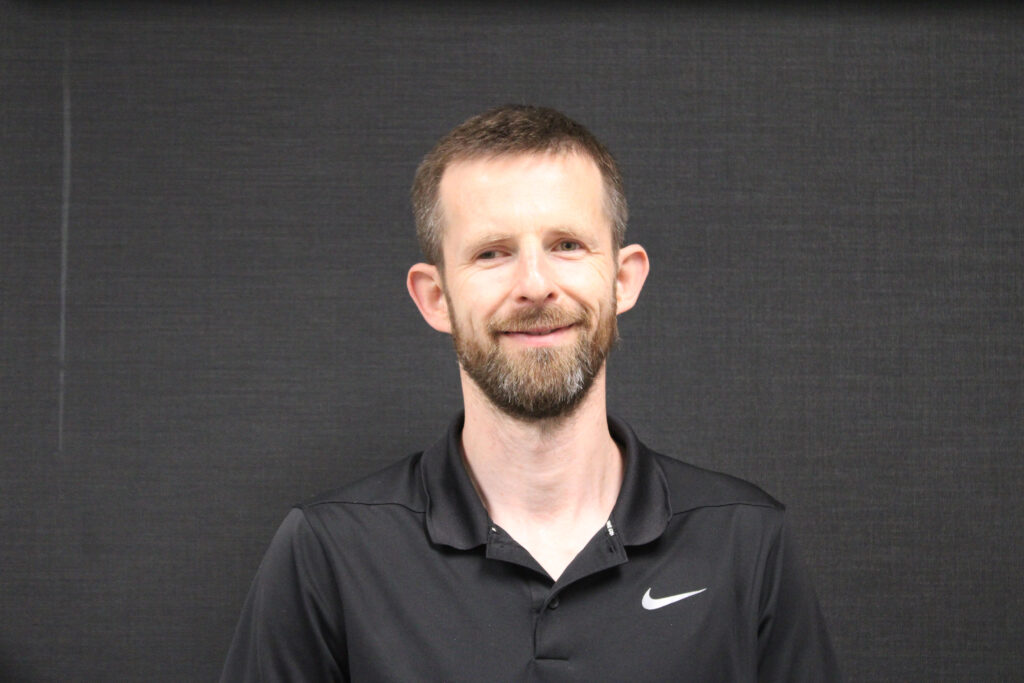
I recently had a chance encounter with a statistician—Pawel Nazarewicz, AP Statistics teacher extraordinaire—grading homework at my son’s gymnastics class. As Nazarewicz described the interactive and data-centric activities he uses in his class, my own imagination was ignited, and I felt like a young statistician again. Nazarewicz agreed to an interview to share his current interests and insights as they pertain to the AP Statistics program and statistics more broadly. I share that with you here.
How did you discover the statistics field?
I graduated from high school in 1998, before my school offered the AP Statistics exam, just missing that window. I honestly think I would have majored in statistics if I had been exposed to it in high school because of the applied nature of the field. Honestly, when I started studying mathematics in college, a lot of it was very abstract and theoretical and not nearly as interesting as the application-based possibilities in statistics.
When I got my math education degree from the University of Georgia, I took a couple courses in statistics. But I really started getting into statistics when I started playing online poker and reading some of the more popular culture books about statistics such as Fooled by Randomness, Black Swan, Freakonomics, and Signal and the Noise. Around the 2012 election, I began following Nate Silver’s political modeling, trying to predict the election outcomes using uncertainty, margins of error, and dependent outcomes. I was hooked.
Currently, I teach AP Statistics at Salem High School in Virginia. We’ve grown the AP Statistics class from one section of 17 students in 2017 to more than 80 students during the 2023–2024 school year. Whenever I teach statistical topics, I try to think about real-life examples. We discuss finance, sports, political campaigns, real estate, poker, and anything else that might interest the students.
Tell us how you get students engaged while teaching AP Statistics.
Whenever we introduce a new topic, I try to start with a question or task that can elicit 100% class participation. For example, I’ll ask the students how many pets each of them has. We’ll then plot the data on a dot plot, often with an outlier when a student says, “I have 15 fish, three dogs, and a cat.” Or, “We have 43 rabbits, and I consider all of them my pets.”
This also allows me to start getting to know my students as individuals and the classroom dynamic as a whole. I write the data on the board and ask the students one thing we can now do with it. Inevitably, someone will mention finding the average. So, now we are off to the races discussing one-variable statistics and introducing more formal vocabulary terms such as outliers, quartiles, and boxplots.
As we’ve seen with the popularity of apps like Instagram and Snapchat, people love to be able to talk about themselves and get insight into their peers. Essentially, we engage in an activity, share with the class, and discover statistics from that.
One of my core beliefs is that learning can’t happen without engagement. Real-life examples, especially those that come from student-shared data, lead to high engagement. The most memorable, and thus effective, lessons in statistics are those rooted in relevant and real-life student experiences.
During one of our early conversations, you told me about how you have students use Zillow to gather their own data so you can teach regression. Could you share that anecdote here?
Definitely! I think real estate is one of those things that is naturally of broad interest. Zillow makes gathering data about real estate engaging because many people like browsing and looking at what other houses in their communities look like. So, I start the exercise by opening Zillow and looking at pictures of a house for sale. We talk about the house—what students like and dislike. I then go into a little bit of detail about what I like and dislike about the house as a potential investment. Students are quick to share their opinions since there is no right or wrong—it’s simply what they like and dislike about what they see in the pictures.
Zillow has a proprietary algorithm that gives the value of a house, the “Zestimate.” We look at a bunch of houses close to a particular neighborhood and collect the Zestimate values in one column with corresponding square footage in another. I then ask students to find houses they would consider under and overpriced based on those two columns.
Often after collecting data, we try to organize it into a visual—in this case, a scatterplot. So, then we would create a scatterplot where we have the square footage of the house on the x axis and the estimated value on the y axis. And then I would ask the students what they notice about the data in the scatterplot. A recent data collection looked like Figure 1.

Next, we start to extract the statistics from the analysis. We discuss a general framework for describing a bivariate relationship (including shape, direction, and strength). This leads to a discussion of a regression line, correlation, and residuals and outliers. One of the specific points is the original house we started with. We can point to it and describe it in the context of that sample.
As before, start with low-hanging fruit that draws out engagement. Everyone knows what a house is. People have a sense of square footage. In general, we expect bigger houses to be worth more than smaller ones. But not all of them are! Then, slowly introduce common vocabulary and concepts that will help us discuss the issue more formally.
I can see how the students are engaged by this approach! I wish we had shared data analytic spreadsheets when I was a kid. Getting promising students interested in statistics is a major service to our discipline. Can you tell us about your approach here?
At a lot of schools, statistics is seen as the course for students who are not quite able to hack calculus. Breaking that stigma in the minds of the student body is critical. At Salem High School, we encourage all students who like math to take both AP Calculus and AP Statistics, rather than routing the strongest only to calculus and the remainder only to statistics. All our strongest students double up at some point.
Is there anything the broader statistical community can or should do to contribute to the health of AP Statistics?
Making high school students aware of all the professional opportunities that exist in the statistics field. Discussing potential employment opportunities and what would be expected of people doing those jobs.
What’s the most important statistical lesson you hope your students learn in AP Statistics?
You know the expression, “A picture is worth a thousand words”? Creating a visual that highlights the topic or concept you are trying to communicate is infinitely more powerful than any numeric summary.
For example, in basketball analytics, they make heat maps of the locations from which players take shots. I saw one that had the Houston Rockets and it was immediately clear almost all the shots were either dunks/layups or three-pointers. While there are some mid-range jumpers, players were mostly taking dunks or layups (very high probability shots) or three-pointers, which are worth 50% more than dunks and layups. So, the three-pointers were kind of lower percentage shots, but they were worth more. So, the expected value was still pretty high, right? Whereas, if you take a long two-point shot, you’re only getting two points, and it’s a lower probability than a dunk or layup.
So, while you can talk about all these things, showing students a heat map is much more powerful. Same with a good scatterplot, histogram, etc. Humans are a visual species. If you can narrow down the essence of the thing you’re trying to say to a graph or an illustration, then you are going to be able to communicate on such a more visceral level. You are going to be much more effective than if you just present a lot of numbers. I would say the art of statistics comes in being able to communicate the data through visuals.
What part of your job do you like best?
I like coming in and having conversations about things I find interesting with people who are also interested. My students are on their way to adulthood and are soon going to be having to make some major decisions about what they want to study and what they want to do. They are in a transition stage, heading toward adulthood, with their whole life in front of them. I firmly believe the world is becoming increasingly data-driven and exposure to statistics at the high school level will help them navigate this brave new world. Increasingly, more jobs require people to have a rudimentary-to-solid understanding of data and statistics and be able to engage in conversation related to those topics. So, I want to expose my students to this world early.
No job is perfect. Can you tell us what your least favorite part of the job is?
Like most teachers, I don’t like the whole process of grading. I also understand how important feedback is for the students. And students need to be assessed regularly so they can make adjustments and the teacher can potentially make adjustments. Other than that, I work with great kids and a supportive administration and department.
ChatGPT and other AI platforms have sort of taken the world by storm. I think a lot of people in our generation (I am 41) worry about how AI that can competently do a students’ homework will impact education. Have you seen anything about recent technological developments such as ChatGPT that are impacting your teaching?
I don’t think they’re impacting my teaching. I think if ChatGPT can work out a student’s homework, I have to question how valuable that homework is in the first place. Teachers in the English department have told me it is blatantly obvious when a paper was written by an AI bot. Then again, I know things are going to get increasingly more sophisticated. In some ways, it’s a little like the Turing test—how do I know if the work that’s presented to me is from that specific student or something else?
I want students to be able to think and communicate statistically in the end. I have some sort of brief conversation with most of my students daily, which gives me good insight into their current level of understanding. If a student is seldom able to engage in meaningful conversation in class but suddenly starts excelling at formal assessments, that would be a red flag that would warrant additional investigation, especially if it happens more than once.
I almost never grade homework; I believe it’s just an opportunity for students to get additional practice outside the classroom and help them prepare for formal in-class exams. So, I honestly don’t know how someone could use ChatGPT inappropriately in my class.
In fact, my students overwhelmingly prefer paper and pencil exams. They like working out problems on paper, showing all their work, and then getting feedback in that format. That said, for very large lecture classes, it becomes more difficult and more expensive to do all pencil and paper exams. It takes a little longer to grade, but a teacher can have much greater confidence in the integrity of the results of the assessment.
There is a little humor and irony here. I noticed you grading statistics homework at our kids’ gymnastics class. That isn’t your favorite part of the job but it is the reason we recognized each other as statisticians. We probably wouldn’t have met if you hadn’t been diligently working on the part of your job that is your least favorite.
Agreed! Life can be full of serendipity when you pay attention to what’s going on around you.
Chris Franck
Chris Franck is an associate professor in the department of statistics at Virginia Tech.
Leave a Reply